

The CryptRowe Newsletter provides Math, Stats, and Data insight around the current state of Bitcoin and other Digital Assets. Whether you’re new to Crypto, have some experience, or are a seasoned investor or institutional fund manager, this newsletter is for you.
As a reminder, this email might cut off or not fit into most inboxes so be sure to click “read more” at the bottom or just click the title at the top of the email to be taken to the Newsletter webpage.
Dear Reader,
Hello and welcome to another edition of the bi-weekly CryptRowe newsletter! 🎉
This Newsletter is going to be a bit different than the previous ones. Not terribly different, but a lil’ different. I’m trying something new. Switching things up. Dancing to a different song. Or maybe the same song in different way.

Ok, so that’s not fully true. Same song, just packaged different maybe. 😏
“Why?” you might ask. Well…
I’m always iterating in my own life. Rarely does much stay the same (how many times, you might wonder, have I altered my ideal fridge storage strategy? 😏) So this newsletter is and has been no different - I will always iterate ¯\_(ツ)_/¯.
I want to be more concise and clear for long term investors that don’t spend more than 10-30 minutes a week thinking about investments.
I want to be more data-only focused for people who want more in-depth analysis (remove even more subjectivity from what I present).
I want to streamline how long it takes me to make these newsletter (which honestly I automate everything anyways so it’s not that big a lift). Remind me to tell you all about the chat-bot plugin app I made at a company I used to work at that posted this gif anytime anyone typed the word “mystery” 😂.

I’ve also realized that trying to write a newsletter for short-term predictions is… more nuanced than a newsletter allows. “Short Term” also can mean a lot of different things to different people (esp. if I don’t define the timeframe and leave it loose and nebulous 👀).
I have no interest in trying to duplicate work. And in my mind, there are others who do a far better job at describing Macro econ things so I will just do a few sentence summary as it relates to Digital Assets and then link to the smart folks at the bottom 🤝.
So without further adieu - here is the updated newsletter. Be sure to read the sections to see what’s changed 🙃 🎉. Enjoy!
Sincerely,
Matt Rowe
Table of Contents
Summary (TL;DR) ✅
Long-Term Charts 👴🏻
Shorter-Term Charts 👦🏼
Price Levels 📈
Other Interesting Charts 🧐
Lol of the Day 🎉
1: Summary (TL;DR) ✅
This section contains a short-and-sweet summary for the casual investor who only has time to check their portfolio less than 30 minutes a week.
Macro Economic conditions still aren’t great. QT continues (not great for Digital Assets). The energy situation in Europe + Russia’s invasion of Ukraine continues. We are still in “not great for risk-on” assets like Bitcoin.
Two relevant tweets:


Also this is a big week because the FOMC releases their statement for their rate hikes.

Long Term, Bitcoin is still in a great buying opportunity zone. Long Term Investors: buying Bitcoin here has historically led to (outsized) positive returns in 6 mo. to 1 year.
Shorter term impulses, I see still as bearish (see charts below). As I have continued to expect, I still expect further downside over the coming weeks (driven primarily by Macro Economic factors). Invalidation for me would be a sustained impulse above $25k, along with confirmation from some of the charts below.
My plan is to deploy more long-term capital into Bitcoin around $15k and $10k (if we go that low).
2: Longer Term Charts 👴🏻
Charts in this section help us identify longer term, HTF (High Time Frame) trends.
The Long Term Aggregate Bitcoin On-Chain indicator (below) combines about 14 On-Chain and Technical Analysis indicators.
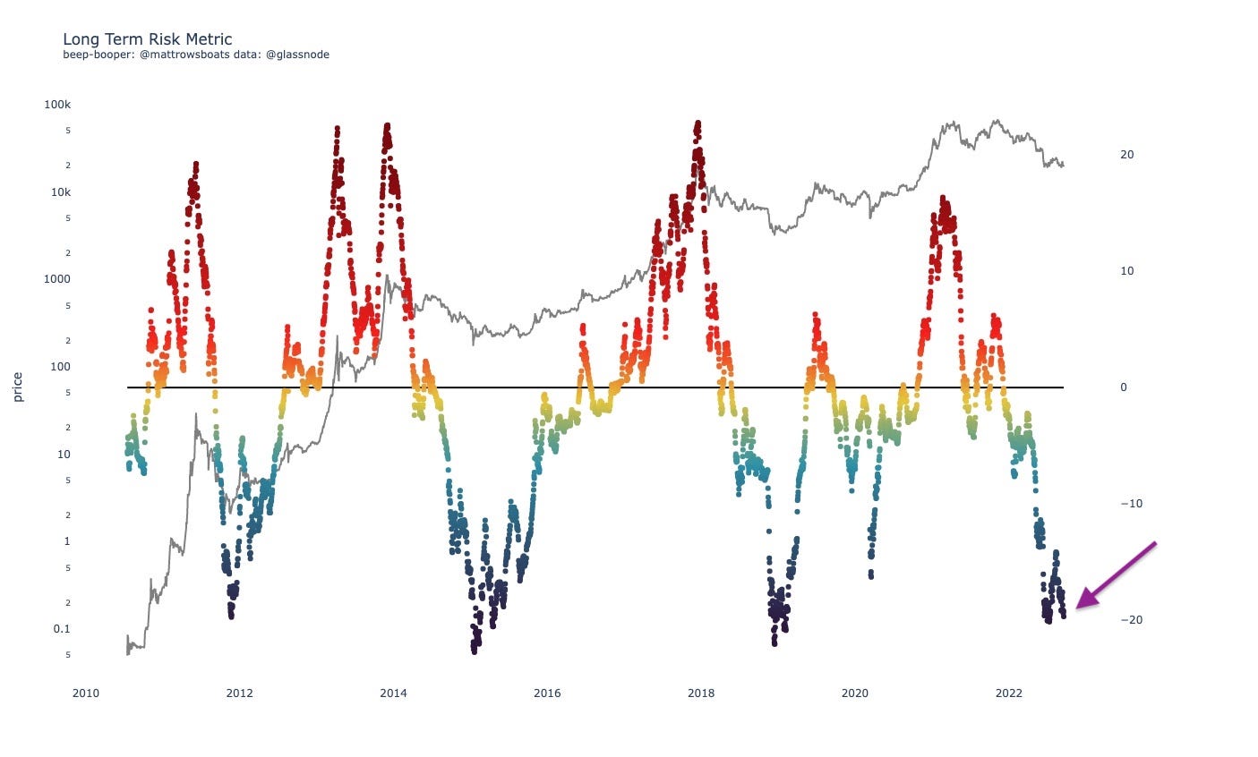
The above chart shows us that we are in a long-term, historically (very) undervalued period for Bitcoin (i.e. good long term investment opportunity).
The following (below) eval tool takes the Long Term metric above and tells us “well, how good of an investment opportunity is it right now though?” Each row is a value range, and the colored dots tell us (includes all data points from the “from date”) what the forward return was for that data point N days forward (N says in the chart title). The Red bars are the Medians and the Black bars are the weighted averages (means).
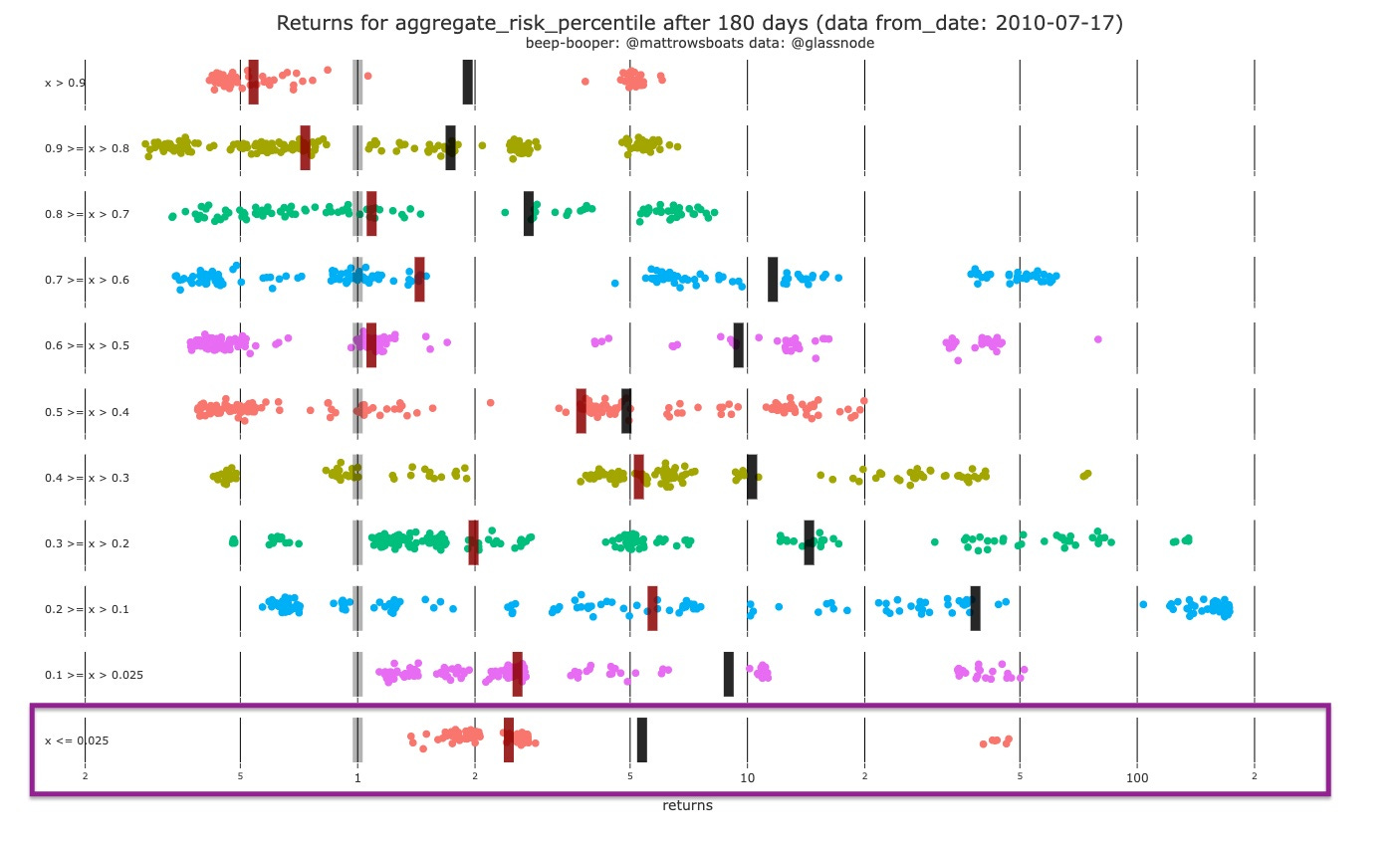
The Eval tool above tells us that for the current value of the Long Term Risk Metric (purple boxed range) we’ve never had a historical negative return after 180 days. And that the mean and median returns are 5x and 2.4x, respectively.
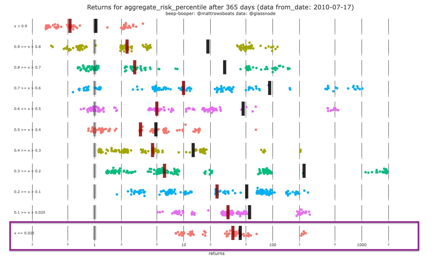
For the below, 365 day period. We still have, historically, never seen negative returns and the mean and median returns are 43x and 36x, respectively
3: Shorter Term Charts 👦🏼
The Binary Aggregate chart I built combines some of the metrics I look at for confluence of momentum. Each of the metrics has a “above/below” signal that helps show whether it’s a good time to buy or not. I just put them all together. It uses the: Market Realized Gradient Oscillator, Hodl Wave Crosses (24h-1m and 1m-3m), Heikin Ashi’s. For sustained run-ups we usually need to see floods of green on all indicators.
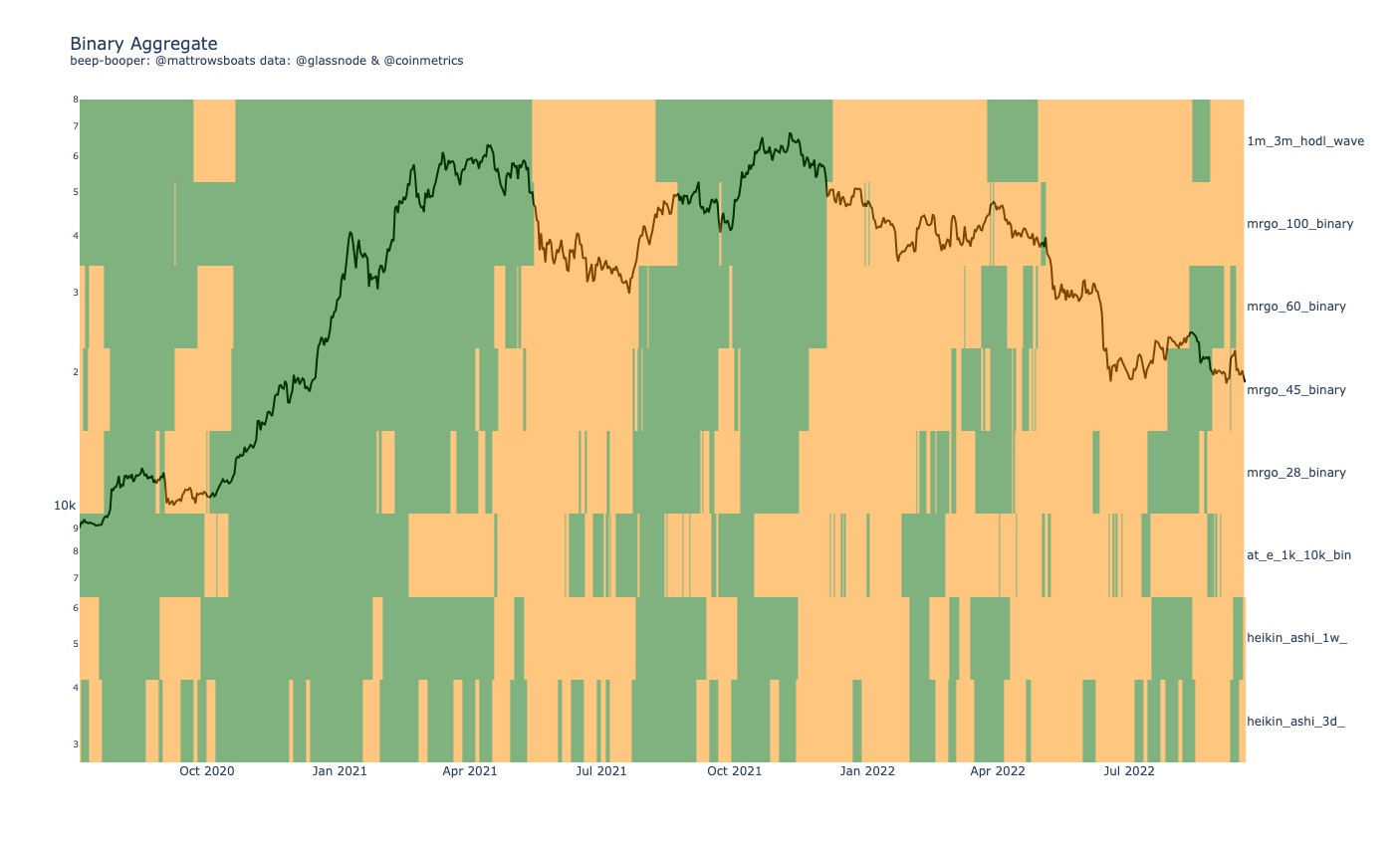
Currently, in the chart above we see desert-land. No confirmed green for sustained run ups in the shorter-term. The desert areas / attempted greens from August 2022 + April 2022 look surprisingly similar as well.
The % Change Accumulation Trend (below) divides up Bitcoin entities and addresses into quantity-owned based cohorts. So, the 10_100 cohort owns between 10 and 100 Bitcoin. We then look at the % change from N days ago (says in chart title) and then color that based on the % change (red for selling / distribution and green for buying / accumulation).

What we see in the chart above is pretty neutral across the board except for some selling in the 10k_100k and 1k_10k Entity cohort. Back in August we saw a pretty strong exchange between both entities and addresses with more than 100k BTC and 1k_10k BTC. But for now, it all looks kind of meh (except of course for that steady stream of less_1 entities stacking 🤝 🎉).
The Cohort Divergence chart below compares two cohorts (named in the title) and checks whether they are both adding to their holdings, both subtracting from their holdings, or doing one or the other (so four possibilities). Dark Blue means both are buying, Red means both are selling, Orange means the “smaller” cohort is buying and the “bigger” cohort is selling, and light blue means the" “smaller” cohort is selling and the “bigger” cohort is buying
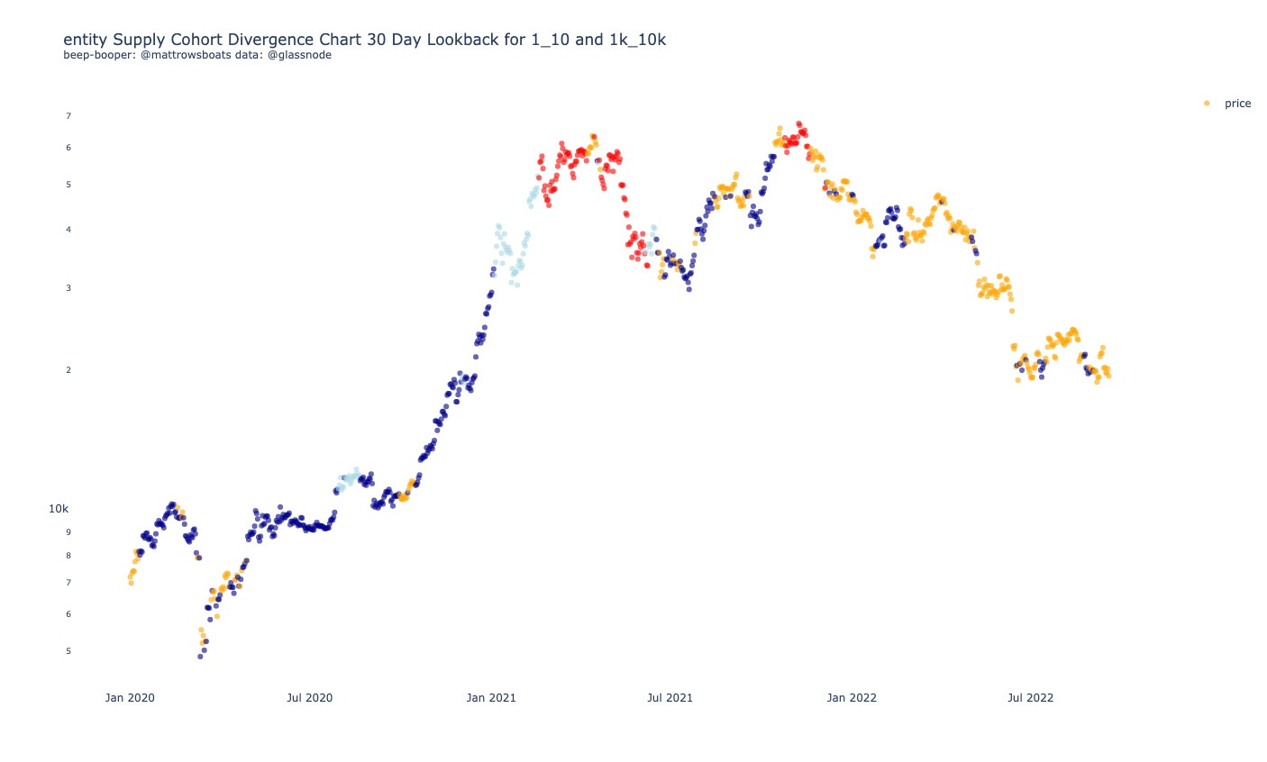
The chart above shows us that currently, only the" “smaller” cohort is buying (orange). We’d want to see dark blue for sustained run-ups and we don’t see that. 😬 If we see red coming… woof.
4: Price Levels 📈
The Price Levels chart (below) shows relevant On-Chain and TA (Technical Analysis) Price Levels. Included is the Realized Price to Liveliness Ratio (rpl), the Short Term Holder (< 155 days age group) Cost Basis (rp_sth), the 200 Week Simple Moving Average (200w_sma), the Long Term holder (> 155 days age group) Cost Basis (rp_lth), the Cost Basis of holders aged 6 months and older (6m+), the Cost Basis of holders aged 1 year and older (1y+), the Cumulative Value-Days Destroyed (cvdd), and the Delta Price (delta_price).

More zoomed in.

So what we see above is that we are well below both the Short Term and Long Term holders Realized Prices, and that sitting below us are quite a few important price lines (1y+, CVDD, Delta Price). I’m betting on a visit to them at some point soon.
Below is a Carpet Contour plot for the URPD Entity-Adjusted data. The darker the color the higher % of Bitcoin supply that last moved at that price range (divided into 1% buckets from ATH).
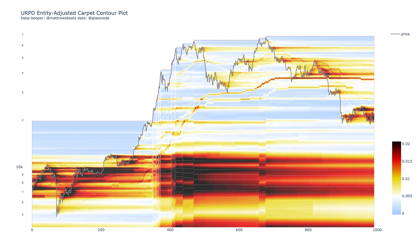
More zoomed in.

As we can see from le charts above we have lots of supply that has transacted last around the $12k range (to start) and that in the last few weeks we’ve created quite a bit of supply exchanged in this little range between $19k and $25k, seemingly as resistance more than support. But a blast through them could change all that.
¯\_(ツ)_/¯
Below is my attempt at Technical Analysis for you all *bows gracefully*.

Previous ATH could hold, but given the macro landscape I wouldn’t count on it.
For more potential shorter term price targets, below are some quartile-analysis based off of historical local min and max’s. For more details on how these work and are calculated see the rabbit trail here. Remember as well, that the most recent print of a local max/min can be a false positive
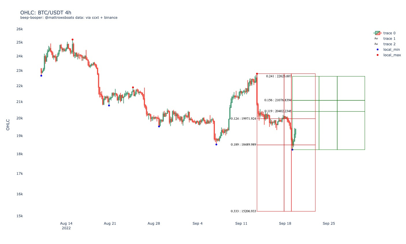
So from the above, BTC’s most recent bearish impulse (red) has surpassed the 50th percentile of percent change and the 50th percentile of duration. Reminder: the green impulse could be a false positive.
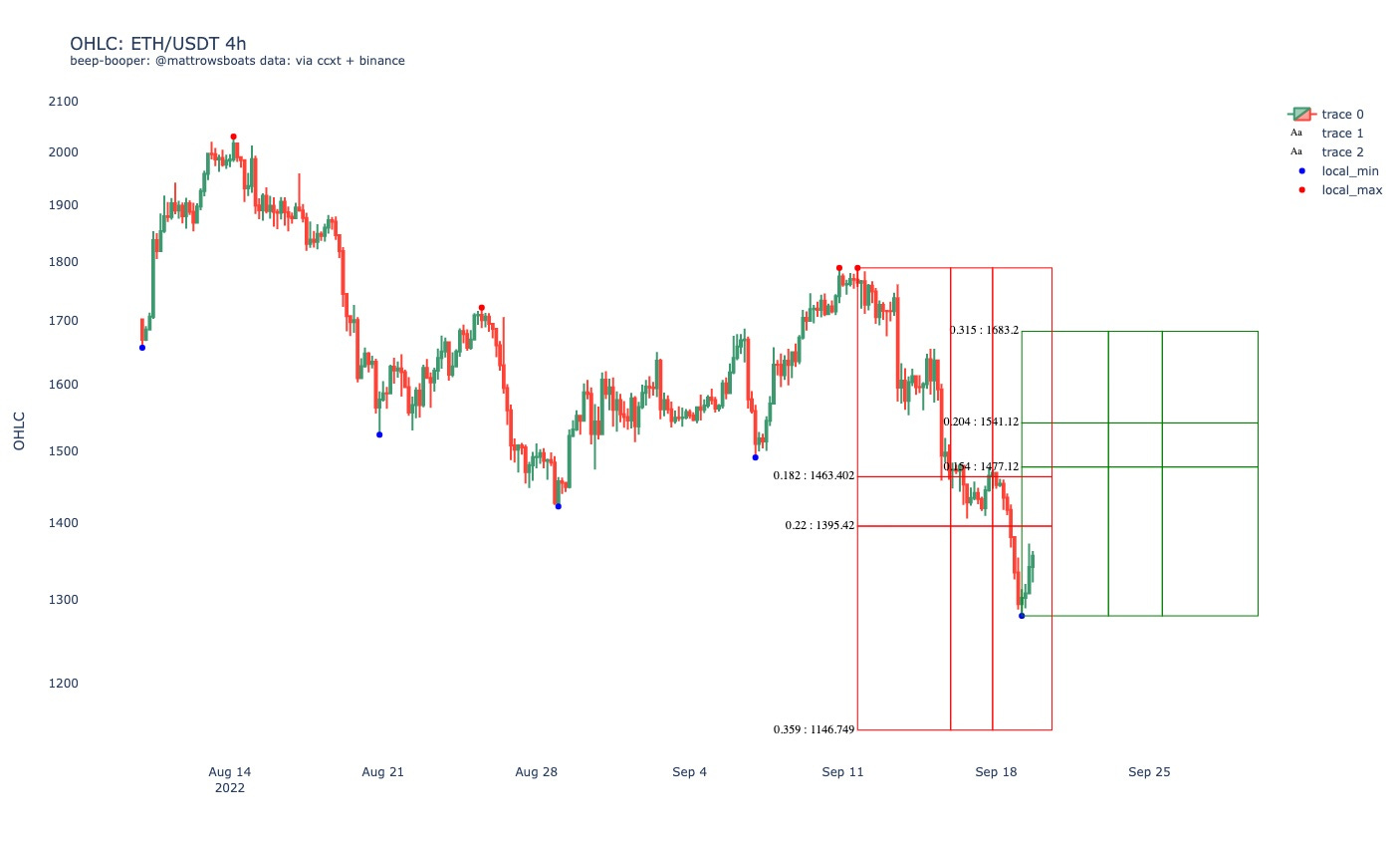
So the most recent bearish impulse for ETH has surpassed the 50th impulse for both percent change and duration, getting close to the 75th percentile for duration. Reminder, the green impulse (bullish) at the end could be a false positive.
5: Other Interesting Charts 🧐
In this section I’ll share a few charts that are interesting / of note. Some of them may already be incorporated into the Long Term risk metric above. As always, these are one-off charts and should be taken into consideration with the entirety of the network, macro economics, etc.
The below shows both the Long Term Holder Realized Price (entities who have held > 155 days) and the Short Term Holder Realized Price (entities who have held < 155 days).
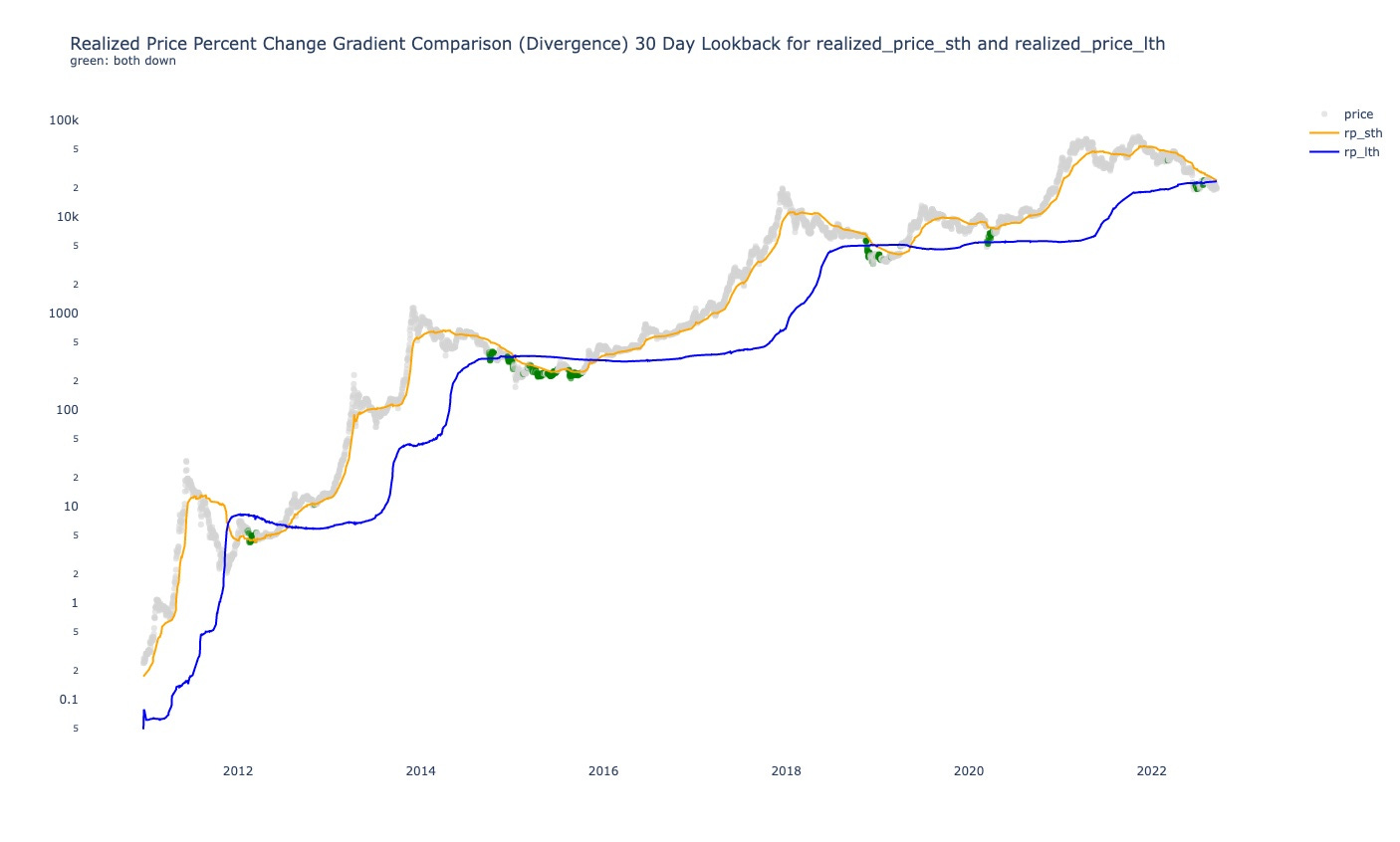
From the above chart we can see that in the Bitcoin bear cycles, we have historically had periods of STH RP below LTH RP.
More zoomed in.
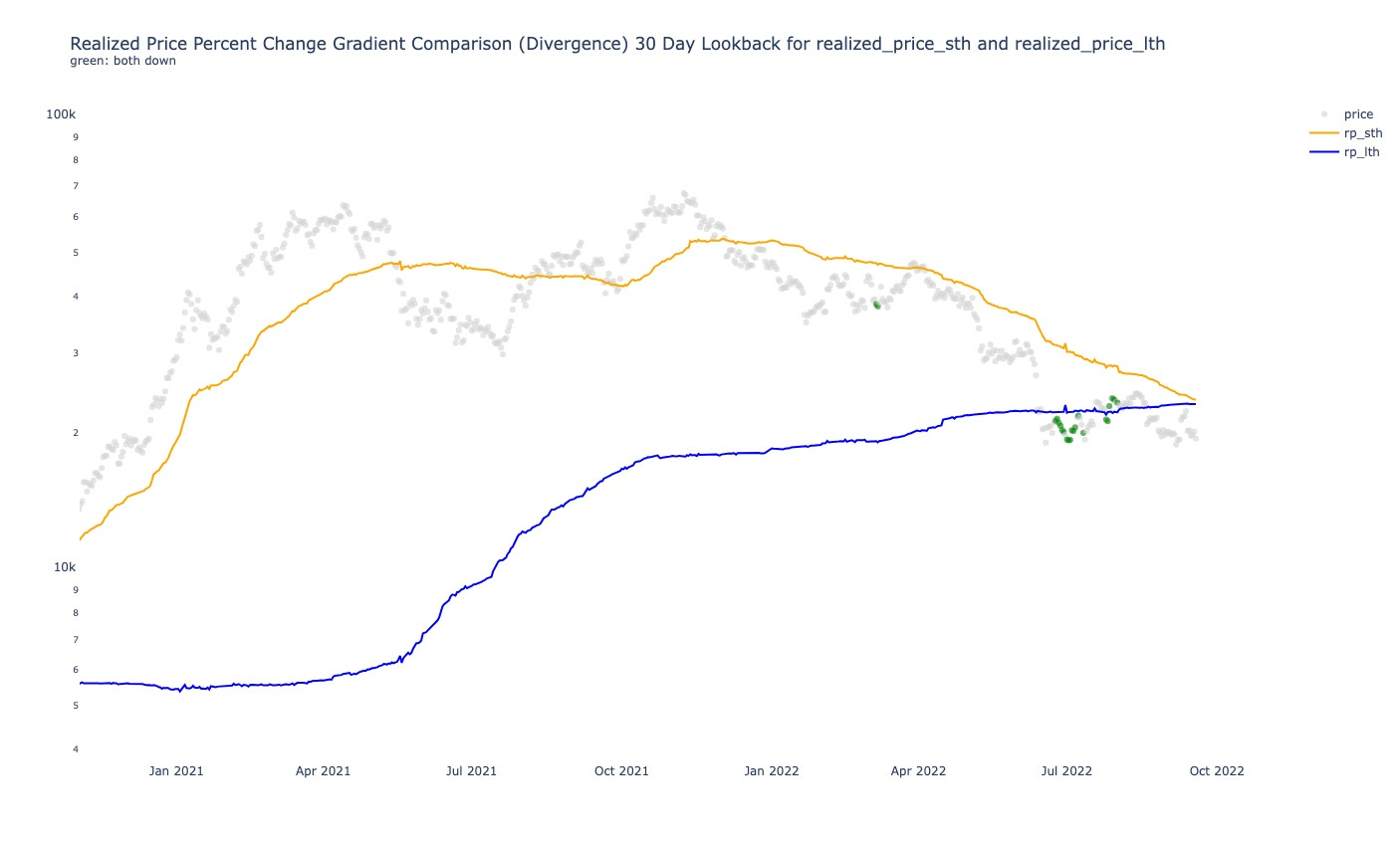
We are getting close to the potential start of that 😏 🎉.
6: Lol of the Day 🎉
A lol just in case the economy or whatever else has you down.
This isn’t a lol but I just love this and also have a t-shirt of otters holding hands so ¯\_(ツ)_/¯.

Closing
And that’s it! As always, if you have questions, desires for clarification, or thoughts on how to improve this letter for yourself or others please reply and let me know or reach out on Twitter.
Also, if you are interested in any kinds of individual consulting services regarding your own Bitcoin or Crypto journey (getting started, trading, analytics, learning, advising, etc.), feel free to respond to this email or follow / reach out to me on Twitter, where I also post more nuanced / individual metric-specific charts there more often.
As always, this post is free and if you enjoyed it or learned something feel free to share it 😊 🎉.
Thank you for reading!
Sincerely,
Matt Rowe
Library (Resources)
Macro All Stars
Lyn Alden, Ecoinometrics, TXMC, and Mr. Alf
Useful Threads and Articles
Data Provider: Glassnode (free on-chain charts, paid tiers available, I have T3).
My Twitter: @mattrowsboats
Crypto Learning Twitter Lists: On-Chain, Macro-Econ, and TA.
Disclaimer 1
Exercise caution, don’t lose it all. Please don’t trade on this newsletter assuming it is perfect information. Everything here is probabilistic and based off of past patterns, which may prove to be invalidated. Short time frames are subject to less accuracy as markets can change on a dime due to a variety of factors and events in the world. Use risk management as much as possible.
Disclaimer 2 (the all caps one)
THE CRYPTROWE NEWSLETTER DOES NOT MAKE ANY EXPRESS OR IMPLIED WARRANTIES, REPRESENTATIONS OR ENDORSEMENTS WHATSOEVER WITH REGARD TO THE REPORT/BLOG. IN PARTICULAR, YOU AGREE THAT THE CRYPTROWE NEWSLETTER ASSUMES NO WARRANTY FOR THE CORRECTNESS, ACCURACY AND COMPLETENESS OF THE REPORT/BLOG.
YOU ARE SOLELY RESPONSIBLE FOR YOUR OWN INVESTMENT DECISIONS. WE ARE NEITHER LIABLE NOR RESPONSIBLE FOR ANY INJURY, LOSSES OR DAMAGES ARISING IN CONNECTION WITH ANY INVESTMENT DECISION TAKEN OR MADE BY YOU BASED ON INFORMATION WE PROVIDE. NOTHING CONTAINED IN THE REPORT/BLOG SHALL CONSTITUTE ANY TYPE OF INVESTMENT ADVICE OR RECOMMENDATION (I.E., RECOMMENDATIONS AS TO WHETHER OR NOT TO “BUY”, “SELL”, “HOLD”, OR TO ENTER OR NOT TO ENTER INTO ANY OTHER TRANSACTION INVOLVING ANY CRYPTOCURRENCY). ALL INFORMATION PROVIDED BY THE CRYPTROWE NEWSLETTER IS IMPERSONAL AND NOT TAILORED TO YOUR NEEDS.
BY USING THIS REPORT/BLOG, YOU ACKNOWLEDGE THESE DISCLAIMERS.