


CryptRowe Forecast #21
Credit Suisse, QT, and the Green Ranger

The CryptRowe Newsletter provides Math, Stats, and Data insight around the current state of Bitcoin and other Digital Assets. Whether you’re new to Crypto, have some experience, or are a seasoned investor or institutional fund manager, this newsletter is for you.
As a reminder, this email might cut off or not fit into most inboxes so be sure to click “read more” at the bottom or just click the title at the top of the email to be taken to the Newsletter webpage.
Table of Contents
Summary (TL;DR) ✅
Long-Term Charts 👴🏻
Shorter-Term Charts 👦🏼
Price Levels 📈
Other Interesting Charts 🧐
Lol of the Day 🎉
1: Summary (TL;DR) ✅
This section contains a short-and-sweet summary for the casual investor who only has time to check their portfolio less than 30 minutes a week.
Ok, so last time I said this section was going to be short and not include as much Macro details. Well, that’s still my goal and I hold that caveat. But… so much is happening! 😂 So here we go.
Regarding Macro Econ notes, and as a reminder, QT (which reduces the supply of bank reserves) is ongoing, and is not great for Risk Assets (of which Digital Assets, including Bitcoin, are). Looking at historical Bitcoin correlation to QT and her sister QE (opposite of QT, adds more reserves into the system - bullish for Risk Assets):


One common consensus in the Econ Twitter world is: “We’re bearish Equities, Stocks, and Digital Assets while QT is going on (now). However, the moment the Fed pivots to QE… game on.” Most of the debate / arguments online aren’t “if” the Fed is going to pivot but “when?” The Fed doesn’t have a great track record of following through with how “hard/long” they’re going to run QT:


Another interesting note is that the Dollar is soaring against other currencies.


This chart above is causing all kinds of problems in Europe and around the world. I don’t fully understand all the implications (see Macro references at the bottom for more) but it seems the UK almost had a solvency issue in their bond market. This will continue to develop and, I imagine, cause different kinds of problems around the world.

Also there’s been worries of Credit Suisse failing and possible contagion from that. Possible, but Lyn has some balancing helpful thoughts here:


For the housing market… yikes still:


And an update on something I always keep an eye on (US Wealth Inequality):


Ok, moving on to Bitcoin TLDR summaries :).
Long Term, Bitcoin is still in a great long term buying opportunity with a 100% historical chance of positive returns after 180 days (see chart below). This time could be different, yes - and in some ways I’m betting on it being different because of the Macro landscape. I deployed 25% of my cash allocated to Digital Asset investing around these prices and am waiting for lower to deploy more (Ideally $14k and $10k if we get there).
Shorter term impulses, I see still as flat or bearish (see charts below). I’m still expecting further downside over the coming weeks. I could see a relief rally up to $25k or so. Rejection there would be a recipe for goblin-town. A rip above would probably be game-on and would have to also correlate to the Fed stopping rate hikes + QT (unlikely at the current moment). In general, new lows are on the way with maybe a run up between now and then. 🤝 🎉
2: Longer Term Charts 👴🏻
Charts in this section help us identify longer term, HTF (High Time Frame) trends.
The Long Term Aggregate Bitcoin On-Chain indicator (below) combines about 14 On-Chain and Technical Analysis indicators.
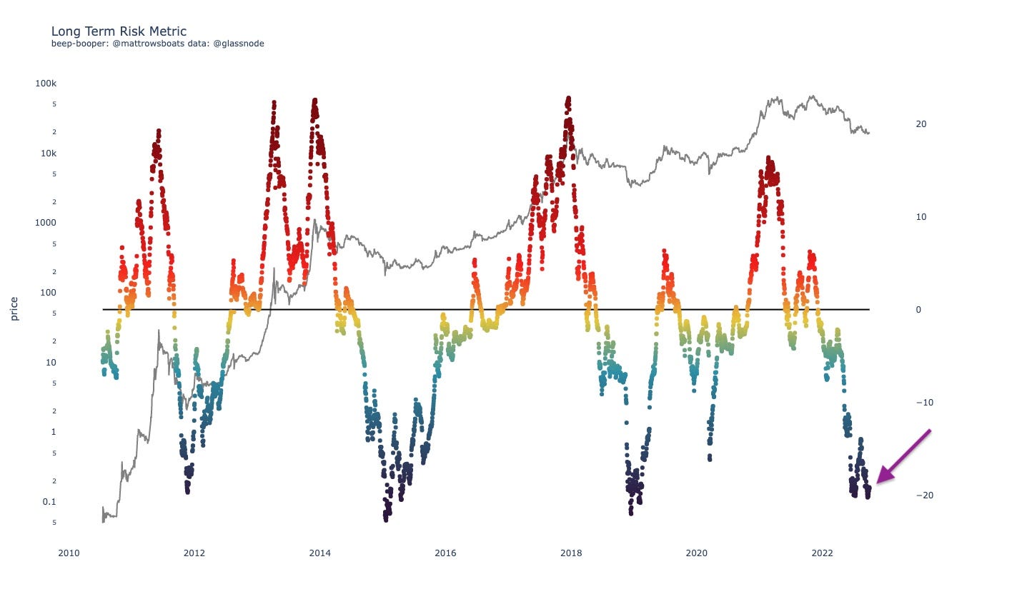
The above chart shows us that we are in a long-term, historically undervalued period for Bitcoin (i.e. good long term investment opportunity).
The following (below) eval tool takes the Long Term metric above and tells us “well, how good of an investment opportunity is it right now though?” Each row is a value range, and the colored dots tell us (includes all data points from the “from date”) what the forward return was for that data point N days forward (N says in the chart title). The Red bars are the Medians and the Black bars are the weighted averages (means)
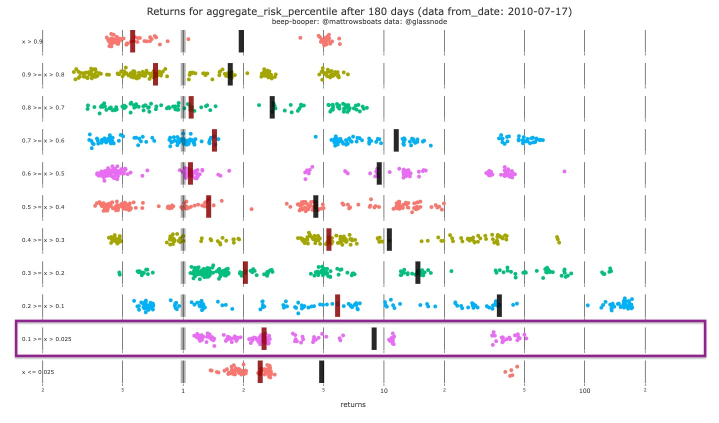
The Eval tool above tells us that for the current value of the Long Term Risk Metric (boxed range) we’ve never had a historical negative return after 180 days. And that the mean and median returns are 9x and 2.4x, respectively. Last Newsletter we were in the row below, and from the purple rectangle (where we are now) we can see we’ve never had historical negative returns, but we have gotten close / had some just very slightly positive returns. After 365 days (chart not provided), however, the data looks strongly positive for both the bottom two rows.
3: Shorter Term Charts 👦🏼
The Binary Aggregate chart I built combines some of the metrics I look at for confluence of momentum. Each of the metrics has a “above/below” signal that helps show whether it’s a good time to buy or not. I just put them all together. It uses the: Market Realized Gradient Oscillator, Hodl Wave Crosses (24h-1m and 1m-3m), Heikin Ashi’s. For sustained run-ups we usually need to see floods of green on all indicators.
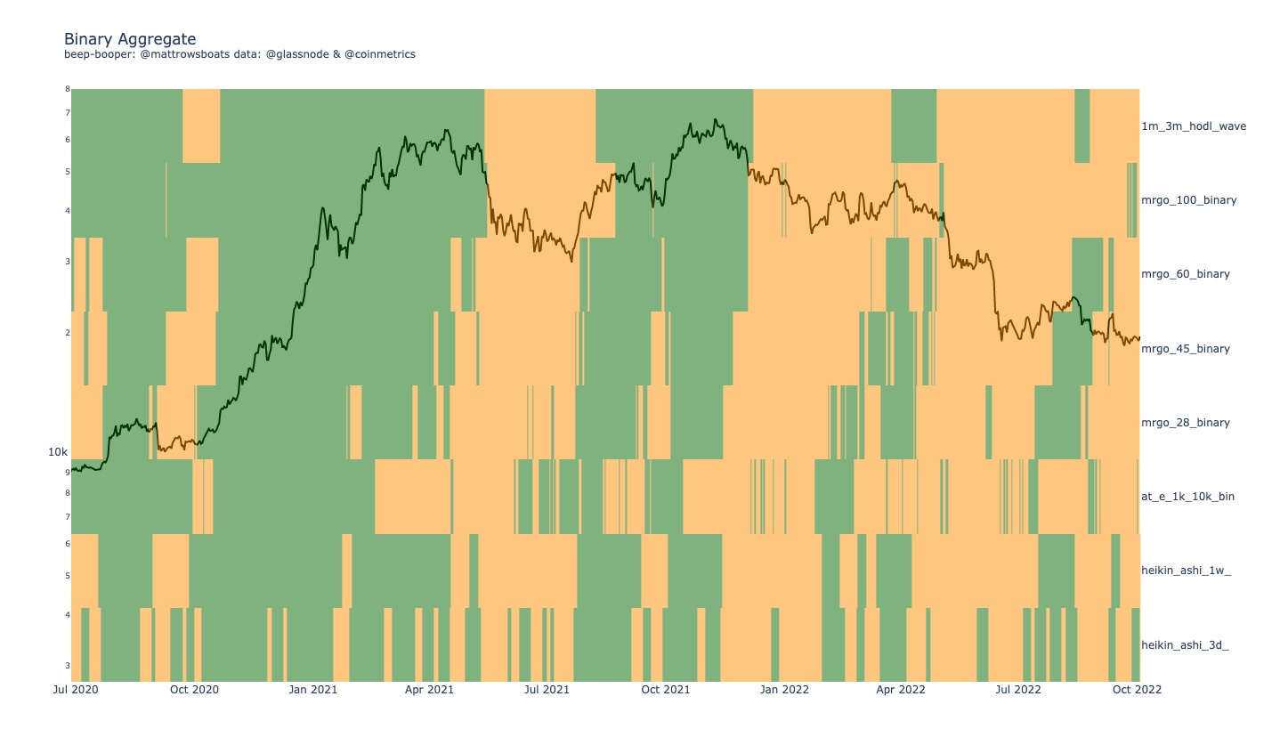
Currently we see a desert region still. Further downside or flat-ness expected still. Some green shoots wanting to come out, but nothing compared to what we saw in previous large run-ups (yet).
The % Change Accumulation Trend (below) divides up Bitcoin entities and addresses into quantity-owned based cohorts. So, the 10_100 cohort owns between 10 and 100 Bitcoin. We then look at the % change from N days ago (says in chart title) and then color that based on the % change (red for selling / distribution and green for buying / accumulation).
As a reminder for this chart I prefer the Entity section over the Address section (Addresses are raw and can include exchanges shuffling coins around - false positives, but for Entities you have to trust the Entity algorithm and also be aware that some transactions might change categorization over time as data further solidifies).
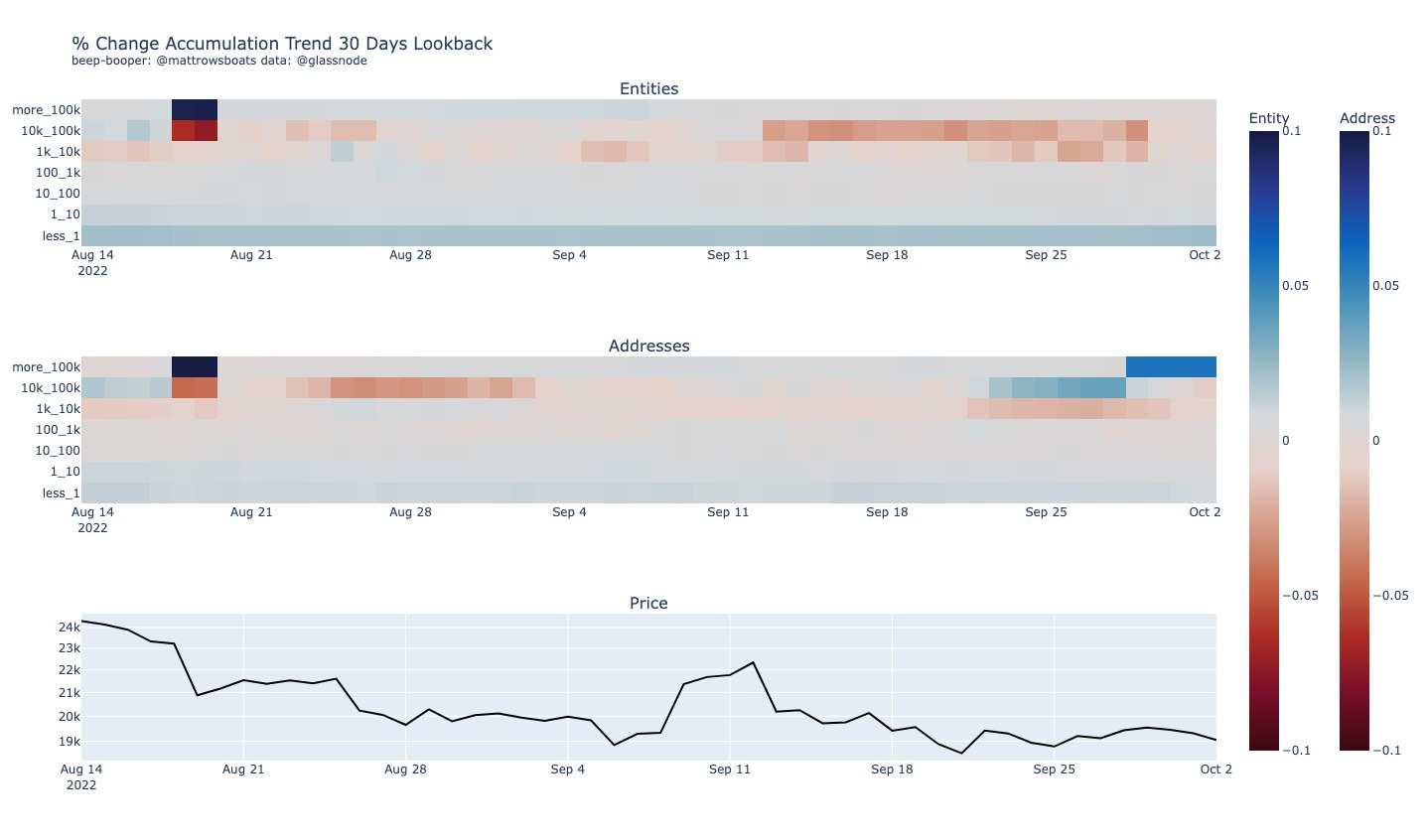
What we see in the chart above is pretty neutral across the board still. Some stronger selling from Entities late September and now just… meh.
The Cohort Divergence chart below compares two cohorts (named in the title) and checks whether they are both adding to their holdings, both subtracting from their holdings, or doing one or the other (so four possibilities). Dark Blue means both are buying, Red means both are selling, Orange means the “smaller” cohort is buying and the “bigger” cohort is selling, and light blue means the" “smaller” cohort is selling and the “bigger” cohort is buying.
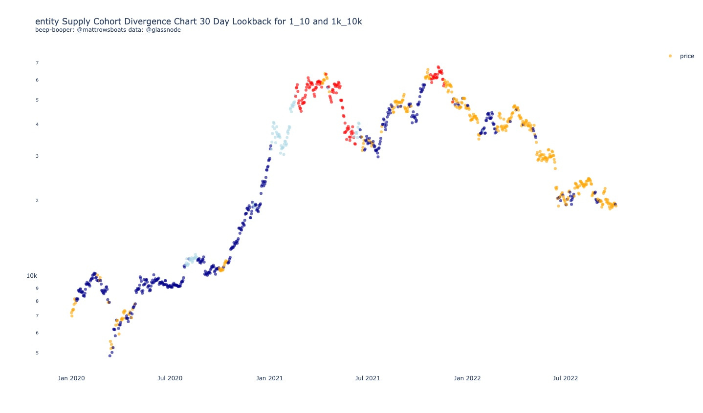
The chart above shows us that currently, only the" “smaller” cohort is buying. We had one day of blue dot in the last few weeks (both cohorts buying) but it wasn’t in large quantities so still, another meh for demand.
4: Price Levels 📈
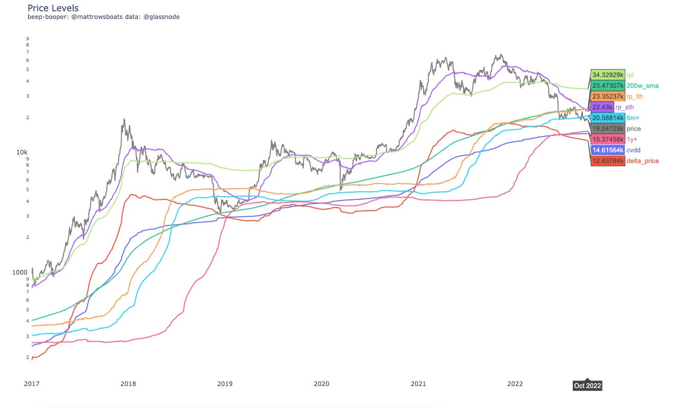
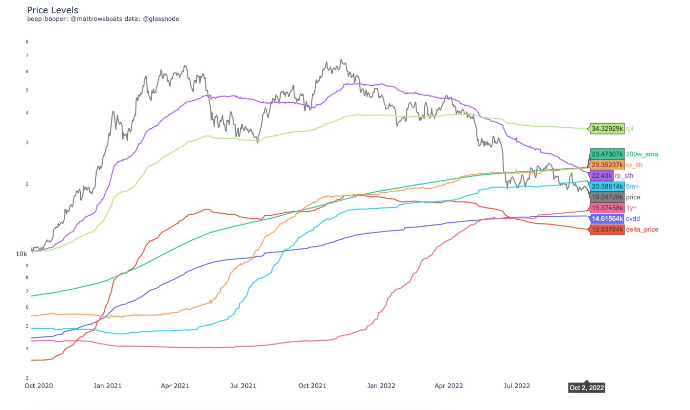
The Price Levels chart (below) shows relevant On-Chain and TA (Technical Analysis) Price Levels. Included is the Realized Price to Liveliness Ratio (rpl), the Short Term Holder (< 155 days age group) Cost Basis (rp_sth), the 200 Week Simple Moving Average (200w_sma), the Long Term holder (> 155 days age group) Cost Basis (rp_lth), the Cost Basis of holders aged 6 months and older (6m+), the Cost Basis of holders aged 1 year and older (1y+), the Cumulative Value-Days Destroyed (cvdd), and the Delta Price (delta_price).
More zoomed in.
So what we see above is some resistance between $20.6k and $23.5k or so. Sustained breaks above this would be bullish to me. Otherwise, I imagine us visiting some of those lower lines in the not-too-distant-future.
Below is a Carpet Contour plot for the URPD Entity-Adjusted data. The darker the color the higher % of Bitcoin supply that last moved at that price range (divided into 1% buckets from ATH).
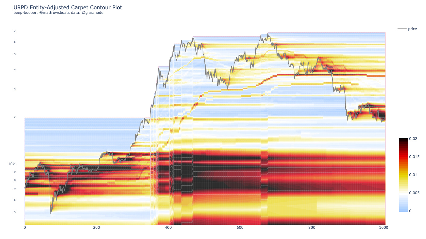
As we can see from le chart above we are sitting under quite a bit of supply distribution. Would take a lot of demand I think to run through that in a sustained manner (which from above we haven’t seen yet on-chain).
Below is my attempt at Technical Analysis for you all.
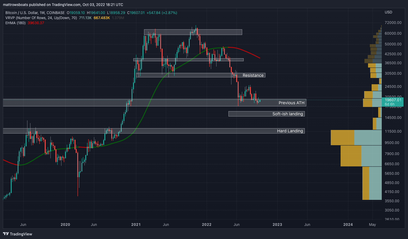
From the chart above, we see a potential double bottom forming around our Previous ATH. The question for all is “will it hold”. Given the macro-environment + all the data above I think not. I could see a relief rally though up to maybe $25k or so. If pushed through we’d probably see a run up but if rejected there I expect that to be the hammer downward to new lows. Just guesses ¯\_(ツ)_/¯ and I’m always ready to be invalidated.
5: Other Interesting Charts 🧐
In this section I’ll share a chart that’s interesting / of note. Some of them may already be incorporated into the Long Term risk metric above. As always, these are one-off charts and should be taken into consideration with the entirety of the network, macro economics, etc.
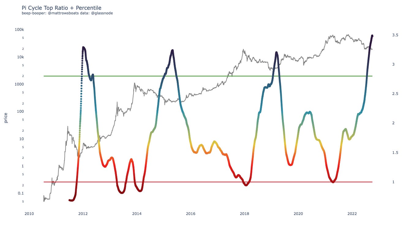
This is the Pi Cycle Top Ratio and historically predicted the “tops” for Bitcoin rather well before. Bottoms decently well too. As for now it’s going off the charts - woosh! It’s simply a Technical Metric and we’ve only had now 3 cycles of data here so I wouldn’t put too much stock into this being a perfect-timing indicator. Interesting none-the-less.
6: Lol of the Day 🎉
A lol just in case the economy or whatever else has you down.
There was a lot of drama apparently this week with Lizzo playing a flute 🤦🏼♂️. I saw this meme and haven’t wanted something to happen more 😂. For the Gen Z-ers / non-Power-Ranger fans in the group this was the Green Ranger’s (Power Ranger’s) flute/sword that would summon his Dragon Zord and I had a toy of it as a kid and it was AWESOME 😂 🎉. #teamLizzoGreenRangerCollaboration


Closing
And that’s it! As always, if you have questions, desires for clarification, or thoughts on how to improve this letter for yourself or others please reply and let me know or reach out on Twitter.
Also, if you are interested in any kinds of individual consulting services regarding your own Bitcoin or Crypto journey (getting started, trading, analytics, learning, advising, etc.), feel free to respond to this email or follow / reach out to me on Twitter, where I also post more nuanced / individual metric-specific charts there more often.
As always, this post is free and if you enjoyed it or learned something feel free to share it 😊 🎉.
Thank you for reading!
Sincerely,
Matt Rowe
Library (Resources)
Macro All Stars
Lyn Alden, Ecoinometrics, TXMC, and Mr. Alf
Useful Threads and Articles
Data Provider: Glassnode (free on-chain charts, paid tiers available, I have T3).
My Twitter: @mattrowsboats (often provides on-chain analysis)
Crypto Learning Twitter Lists: On-Chain, Macro-Econ, and TA.
Disclaimer 1
Exercise caution, don’t lose it all. Please don’t trade on this newsletter assuming it is perfect information. Everything here is probabilistic and based off of past patterns, which may prove to be invalidated. Short time frames are subject to less accuracy as markets can change on a dime due to a variety of factors and events in the world. Use risk management as much as possible.
Disclaimer 2 (the all caps one)
THE CRYPTROWE NEWSLETTER DOES NOT MAKE ANY EXPRESS OR IMPLIED WARRANTIES, REPRESENTATIONS OR ENDORSEMENTS WHATSOEVER WITH REGARD TO THE REPORT/BLOG. IN PARTICULAR, YOU AGREE THAT THE CRYPTROWE NEWSLETTER ASSUMES NO WARRANTY FOR THE CORRECTNESS, ACCURACY AND COMPLETENESS OF THE REPORT/BLOG.
YOU ARE SOLELY RESPONSIBLE FOR YOUR OWN INVESTMENT DECISIONS. WE ARE NEITHER LIABLE NOR RESPONSIBLE FOR ANY INJURY, LOSSES OR DAMAGES ARISING IN CONNECTION WITH ANY INVESTMENT DECISION TAKEN OR MADE BY YOU BASED ON INFORMATION WE PROVIDE. NOTHING CONTAINED IN THE REPORT/BLOG SHALL CONSTITUTE ANY TYPE OF INVESTMENT ADVICE OR RECOMMENDATION (I.E., RECOMMENDATIONS AS TO WHETHER OR NOT TO “BUY”, “SELL”, “HOLD”, OR TO ENTER OR NOT TO ENTER INTO ANY OTHER TRANSACTION INVOLVING ANY CRYPTOCURRENCY). ALL INFORMATION PROVIDED BY THE CRYPTROWE NEWSLETTER IS IMPERSONAL AND NOT TAILORED TO YOUR NEEDS.
BY USING THIS REPORT/BLOG, YOU ACKNOWLEDGE THESE DISCLAIMERS.