
CryptRowe Forecast #23
Bull Loose in a Bear Shop?

The CryptRowe Newsletter provides Math, Stats, and Data insight around the current state of Bitcoin and other Digital Assets. Whether you’re new to Crypto, have some experience, or are a seasoned investor or institutional fund manager, this newsletter is for you.
As a reminder, this email might cut off or not fit into most inboxes so be sure to click “read more” at the bottom or just click the title at the top of the email to be taken to the Newsletter webpage.
Table of Contents
Summary (TL;DR) ✅
Long-Term Charts 👴🏻
Shorter-Term Charts 👦🏼
Price Levels 📈
Other Interesting Charts 🧐
Lol of the Day 🎉
1: Summary (TL;DR) ✅
This section contains a short-and-sweet summary for the casual investor who only has time to check their portfolio less than 30 minutes a week.
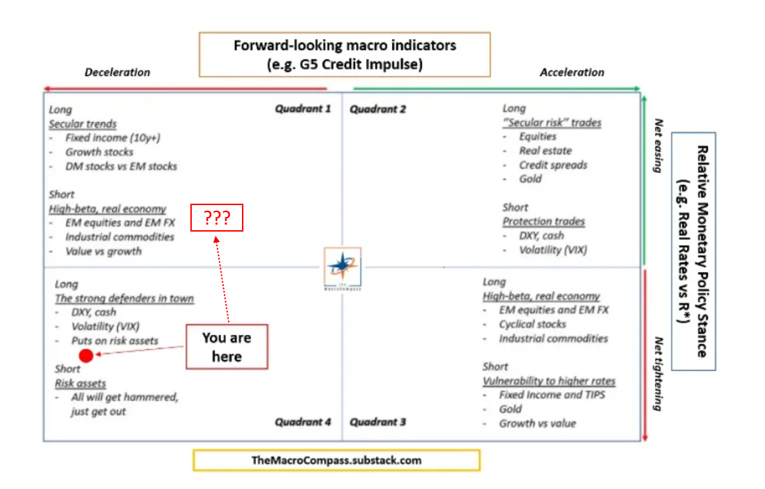
So one of my fave Macro folks is Alf, and he has a Macro Economic “compass” he uses that I think is really simple and helpful for the regular investor. I often get questions, “What should I invest in?” I think this is a pretty good (and simple) guide for folks that are looking to actively manage their portfolios. Also go subscribe to his newsletter for more detailed Macro notes 🎉. Basically, he’s still saying we’re in Quadrant 4, with a potential to move to Quadrant 1 depending on what Central Banks do soon / how the Macro landscape develops. Aren’t there yet, but just a “heads up”.
Additionally, it’s a big week. A lot of folks are hoping the Fed comes in this week more “dovish” (soft) regarding the QT going on, and thus will be bullish for Risk Assets. I am dubious. But we shall see! Here’s everything happening this week.

Besides that I don’t have a lot to share Macro-wise. I was out of town for a week or so and haven’t been on the Twitters as much, so my “pulse” on things is low this time. So just two smol charts for fun.
The first highlights what inflation might look like for us in the 2020s (using, as Lyn has shared over and over, the 1940’s analogue 🙃).

The second highlights a macro correlation to Bitcoin’s price (and thus all crypto’s prices):

So, still seems caution / cash is good for now, with an eye on what the Fed does and how the markets respond.
Long Term, Bitcoin is still in a great long term buying opportunity with a 100% historical chance of positive returns after both 180 days (see last Newsletter) and 365 days (see chart below). This time could be different, yes - and in some ways I’m betting on it being different because of the Macro landscape. I deployed 25% of my cash allocated to Digital Asset investing around these prices and am waiting for lower to deploy more (Ideally $14k and $10k if we get there).
Shorter Term, there’s some bullish confluence in the charts below. The question now is (a) are we in a bullish impulse within a larger bearish macro sentiment or (b) is this the start of a new bullish season? I still am leaning (a) but want to caution because bullish impulses in bear markets are really good at tricking us into thinking it’s the start of something new. I think, for me, unless the Fed changes course drastically, stops QT, starts QE (or some form of QE), I don’t see Bitcoin or Crypto starting a new bull run. That being said, this impulse looks like it could be strong enough to keep running up a bit. If that happens, I think $23k - $25k would be a good resistance level to target. If we don’t make it up there, I could see further lows to the landing spots below, described below.
TLDR; Bullish confluence, but be careful because I don’t see the larger macro context changing much so far / invalidating the difficulties ahead. Also just be careful being “certain” trading FOMC days. Avoid :).
2: Longer Term Charts 👴🏻
Charts in this section help us identify longer term, HTF (High Time Frame) trends.
The Long Term Aggregate Bitcoin On-Chain indicator (below) combines about 14 On-Chain and Technical Analysis indicators.
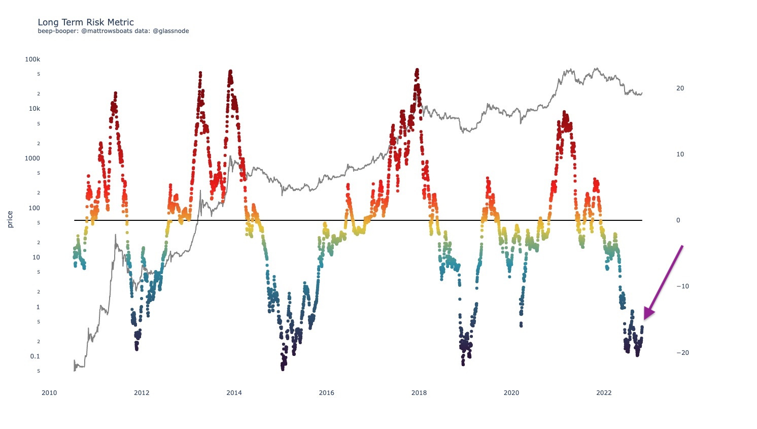
The above chart shows us that we are (still) in a long-term, historically undervalued period for Bitcoin (i.e. good long term investment opportunity). We can see that we’re popping up off of some of the lows. The question for now is, “Is this a bullish impulse within a broader bearish trend? Or is this the start of a new bullish run?”
The following (below) eval tool takes the Long Term metric above and tells us “well, how good of an investment opportunity is it right now though?” Each row is a value range, and the colored dots tell us (includes all data points from the “from date”) what the forward return was for that data point N days forward (N says in the chart title). The Red bars are the Medians and the Black bars are the weighted averages (means)
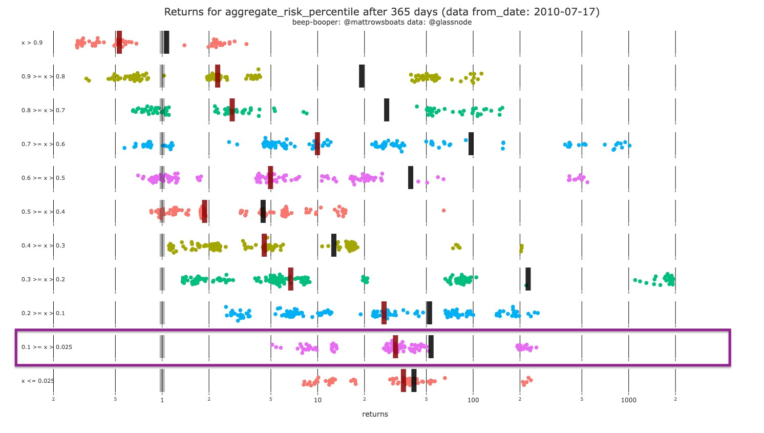
The Eval tool above tells us that for the current value of the Long Term Risk Metric (boxed range) we’ve never had a historical negative return after 365 days. The lowest return we’ve historically had is 5x, and the highest is around 200x. Median/Mean are in the 30x-50x ranges it seems. As a reminder, historical performance isn’t always an indicator of future reality, but it can give us good probability guesses. And I’m less “sure” on any sort of estimations for “multipliers”, and more concerned with “positive / negative” return probabilities.
I also like how the 365 day version of this chart (above) shows us the skew (from top to bottom) of higher probability for non-negative returns the lower the metric goes. 🤝 🎉
3: Shorter Term Charts 👦🏼
The Binary Aggregate chart I built combines some of the metrics I look at for confluence of momentum. Each of the metrics has a “above/below” signal that helps show whether it’s a good time to buy or not. I just put them all together. It uses the: Market Realized Gradient Oscillator, Hodl Wave Crosses (24h-1m and 1m-3m), Heikin Ashi’s. For sustained run-ups we usually need to see floods of green on all indicators.
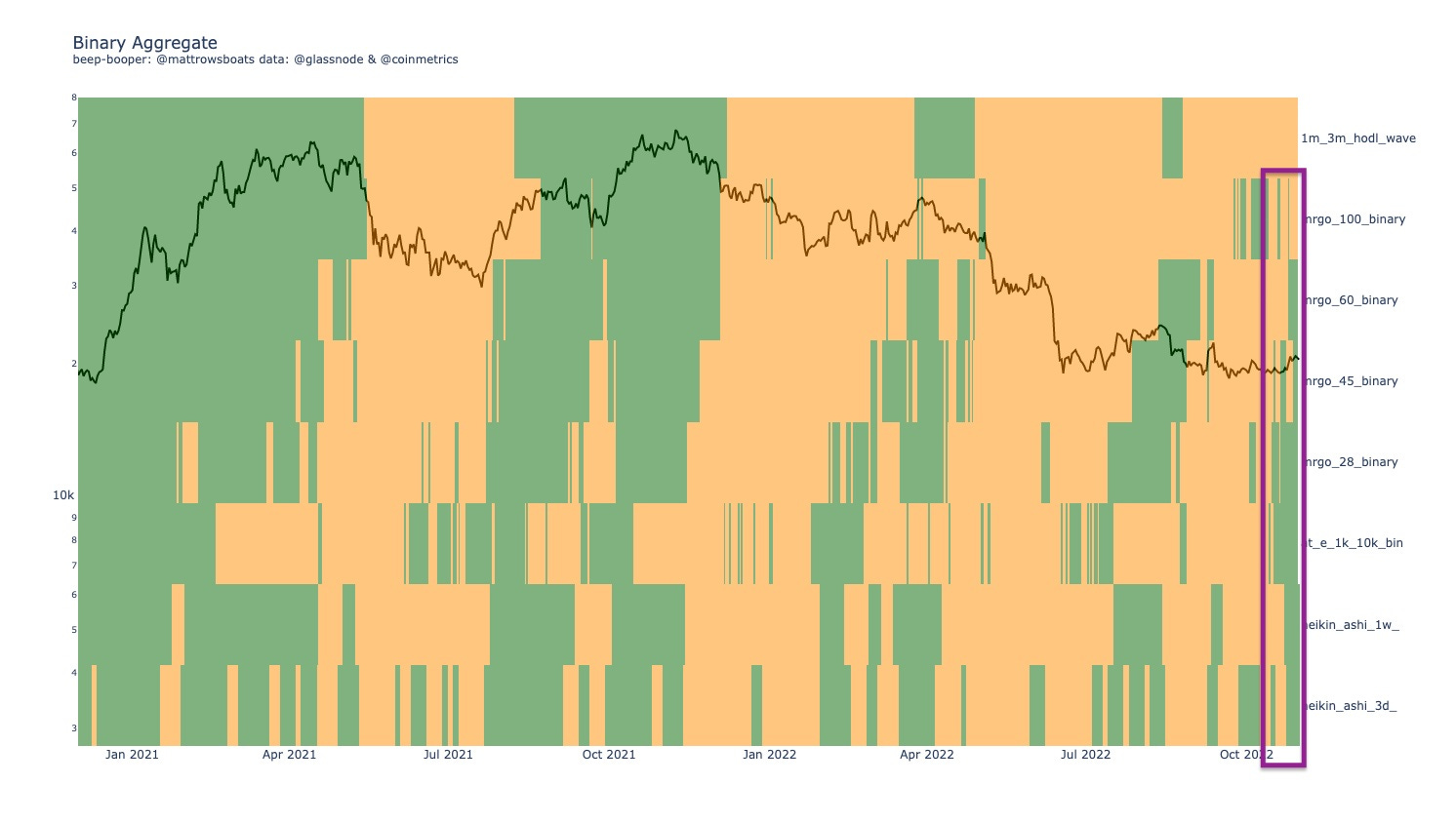
Well what a change a few weeks can make here. I see GREEN! Wowza. Looks like the potential for a run up that either already happened, or is continuing to happen. Regardless, there’s some correlation here between more sustained run ups so far. Something we can’t or shouldn’t ignore. Let’s see if there’s further confluence below.
The % Change Accumulation Trend (below) divides up Bitcoin entities and addresses into quantity-owned based cohorts. So, the 10_100 cohort owns between 10 and 100 Bitcoin. We then look at the % change from N days ago (says in chart title) and then color that based on the % change (red for selling / distribution and green for buying / accumulation).
As a reminder for this chart I prefer the Entity section over the Address section (Addresses are raw and can include exchanges shuffling coins around - false positives, but for Entities you have to trust the Entity algorithm and also be aware that some transactions might change categorization over time as data further solidifies).
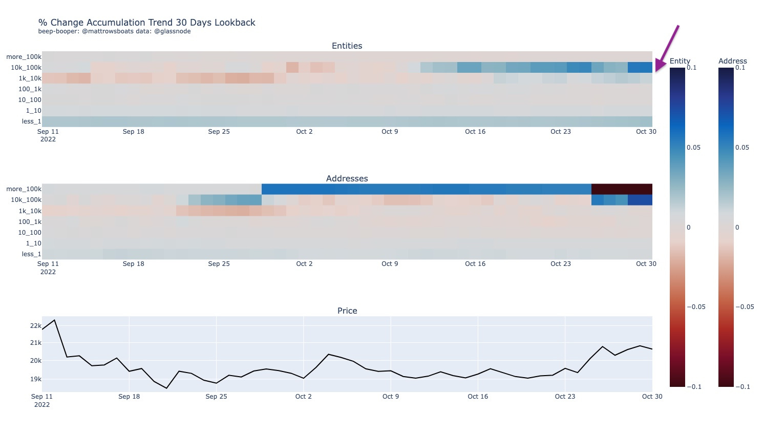
Well look at those whales stacking (purple arrow). This is some large buying going on. Potentially bullish.
The Cohort Divergence chart below compares two cohorts (named in the title) and checks whether they are both adding to their holdings, both subtracting from their holdings, or doing one or the other (so four possibilities). Dark Blue means both are buying, Red means both are selling, Orange means the “smaller” cohort is buying and the “bigger” cohort is selling, and light blue means the" “smaller” cohort is selling and the “bigger” cohort is buying.
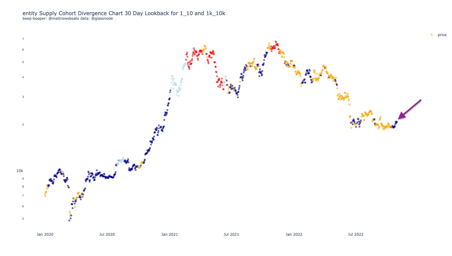
Double Wowza. So, both of our key cohorts are buying here (blue dots) in a sustained way. This is / has been historically bullish.
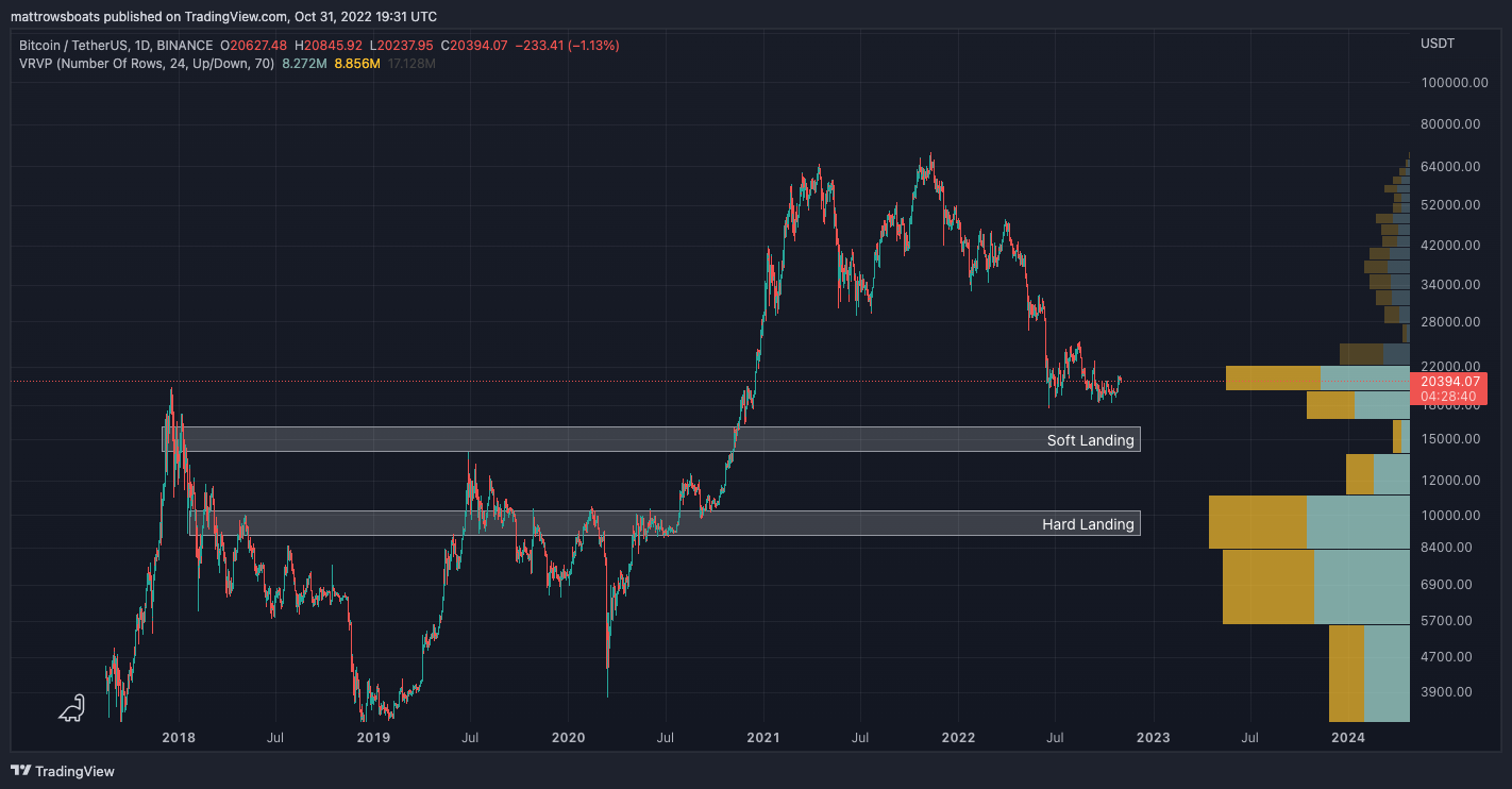
4: Price Levels 📈
The Price Levels chart (below) shows relevant On-Chain and TA (Technical Analysis) Price Levels. Included is the Realized Price to Liveliness Ratio (rpl), the Short Term Holder (< 155 days age group) Cost Basis (rp_sth), the 200 Week Simple Moving Average (200w_sma), the Long Term holder (> 155 days age group) Cost Basis (rp_lth), the Cost Basis of holders aged 6 months and older (6m+), the Cost Basis of holders aged 1 year and older (1y+), the Cumulative Value-Days Destroyed (cvdd), and the Delta Price (delta_price).
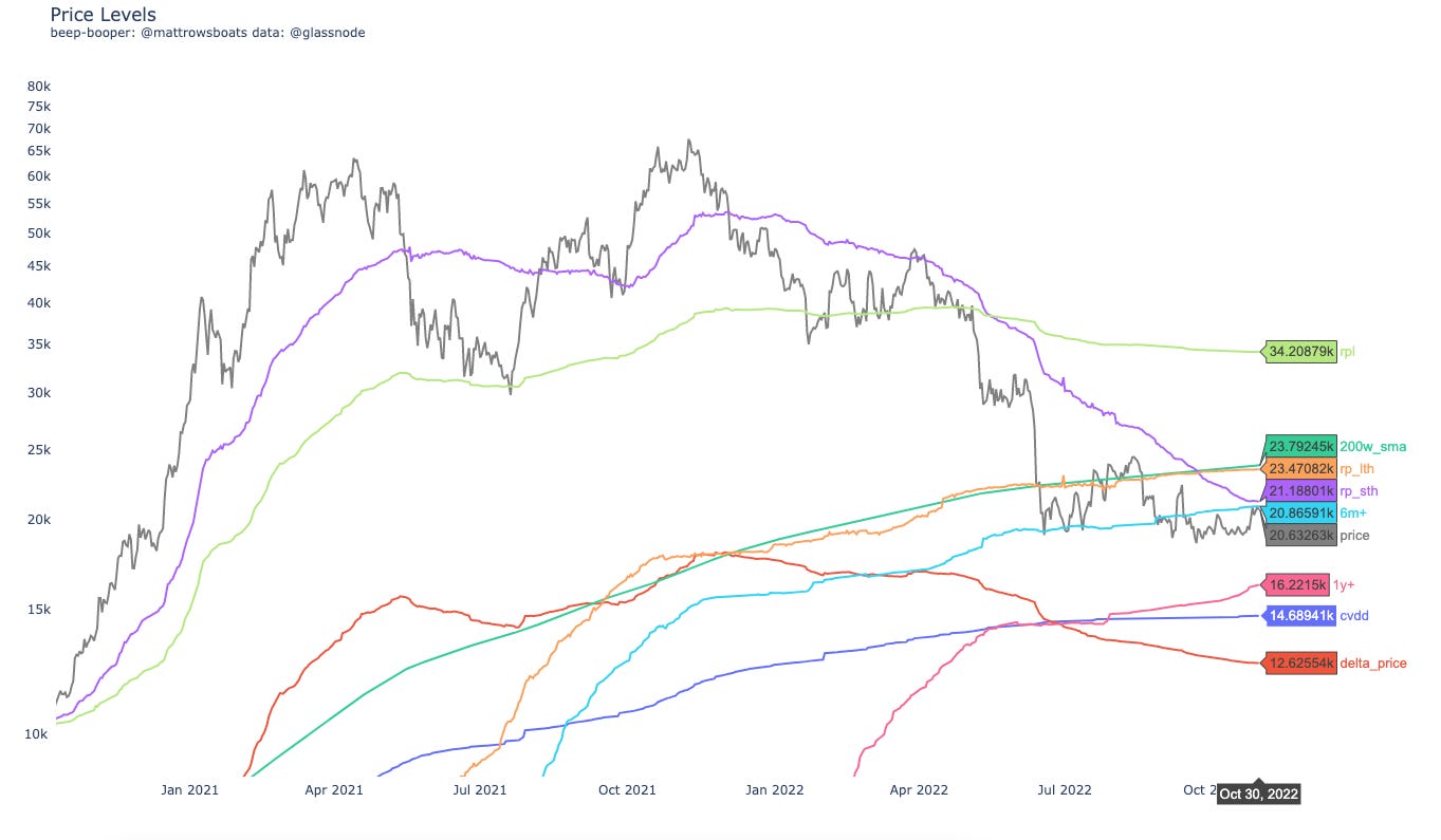
So given the above shorter-term bullish signals, what do we see at price levels? Well we are bumping up against Short Term Holders Realized Price at $21.2k, with Long Term Holders above them at $23.5k. Below, we’re looking again at $16k - $12k.
Below is a Carpet Contour plot for the URPD Entity-Adjusted data. The darker the color the higher % of Bitcoin supply that last moved at that price range (divided into 1% buckets from ATH).
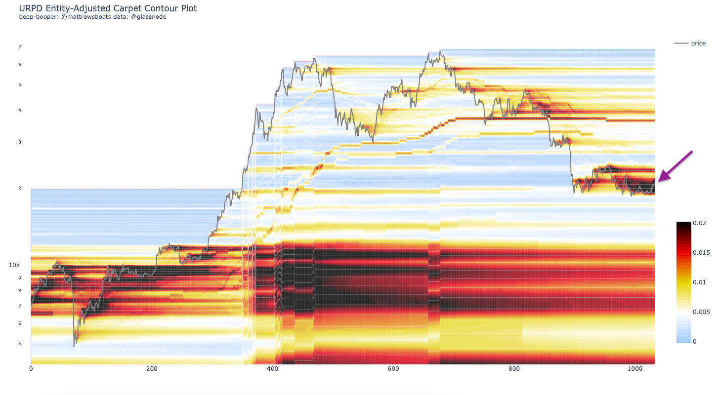
Well wowza for the third time. Price is grinding up through where all of those Bitcoin traded hands over the last few weeks. Will it be able to blow through or not? Certainly there’s resistance where we’re at and above. We shall see 🙃.
Below is my attempt at Technical Analysis for you all.
From the chart above, we still see a potential double bottom forming around our Previous ATH (about where we are now). The question for all is “will it hold”. 😏 🎉.
5: Other Interesting Charts 🧐
In this section I’ll share a chart that’s interesting / of note. Some of them may already be incorporated into the Long Term risk metric above. As always, these are one-off charts and should be taken into consideration with the entirety of the network, macro economics, etc.
The below shows the Hash Ribbon Signal.
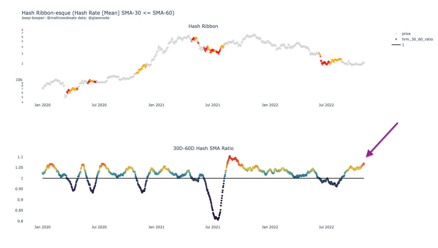
What this chart tells us is that Bitcoin Miners are turning it to 11. I am reading and hearing of some mining companies struggling to keep solvent and profitable. Because of this, there might be some miners turning off rigs soon.
6: Lol of the Day 🎉
A lol just in case the economy or whatever else has you down.
Wishing this kind of energy for you today. Be you. 😏 🎉 :).
Closing
And that’s it! As always, if you have questions, desires for clarification, or thoughts on how to improve this letter for yourself or others please reply and let me know or reach out on Twitter.
Also, if you are interested in any kinds of individual consulting services regarding your own Bitcoin or Crypto journey (getting started, trading, analytics, learning, advising, etc.), feel free to respond to this email or follow / reach out to me on Twitter, where I also post more nuanced / individual metric-specific charts there more often.
As always, this post is free and if you enjoyed it or learned something feel free to share it 😊 🎉.
Thank you for reading!
Sincerely,
Matt Rowe
Library (Resources)
Macro All Stars
Lyn Alden, Ecoinometrics, TXMC, and Mr. Alf
Useful Threads and Articles
Data Provider: Glassnode (free on-chain charts, paid tiers available, I have T3).
My Twitter: @mattrowsboats (often provides on-chain analysis)
Crypto Learning Twitter Lists: On-Chain, Macro-Econ, and TA.
Disclaimer 1
Exercise caution, don’t lose it all. Please don’t trade on this newsletter assuming it is perfect information. Everything here is probabilistic and based off of past patterns, which may prove to be invalidated. Short time frames are subject to less accuracy as markets can change on a dime due to a variety of factors and events in the world. Use risk management as much as possible.
Disclaimer 2 (the all caps one)
THE CRYPTROWE NEWSLETTER DOES NOT MAKE ANY EXPRESS OR IMPLIED WARRANTIES, REPRESENTATIONS OR ENDORSEMENTS WHATSOEVER WITH REGARD TO THE REPORT/BLOG. IN PARTICULAR, YOU AGREE THAT THE CRYPTROWE NEWSLETTER ASSUMES NO WARRANTY FOR THE CORRECTNESS, ACCURACY AND COMPLETENESS OF THE REPORT/BLOG.
YOU ARE SOLELY RESPONSIBLE FOR YOUR OWN INVESTMENT DECISIONS. WE ARE NEITHER LIABLE NOR RESPONSIBLE FOR ANY INJURY, LOSSES OR DAMAGES ARISING IN CONNECTION WITH ANY INVESTMENT DECISION TAKEN OR MADE BY YOU BASED ON INFORMATION WE PROVIDE. NOTHING CONTAINED IN THE REPORT/BLOG SHALL CONSTITUTE ANY TYPE OF INVESTMENT ADVICE OR RECOMMENDATION (I.E., RECOMMENDATIONS AS TO WHETHER OR NOT TO “BUY”, “SELL”, “HOLD”, OR TO ENTER OR NOT TO ENTER INTO ANY OTHER TRANSACTION INVOLVING ANY CRYPTOCURRENCY). ALL INFORMATION PROVIDED BY THE CRYPTROWE NEWSLETTER IS IMPERSONAL AND NOT TAILORED TO YOUR NEEDS.
BY USING THIS REPORT/BLOG, YOU ACKNOWLEDGE THESE DISCLAIMERS.